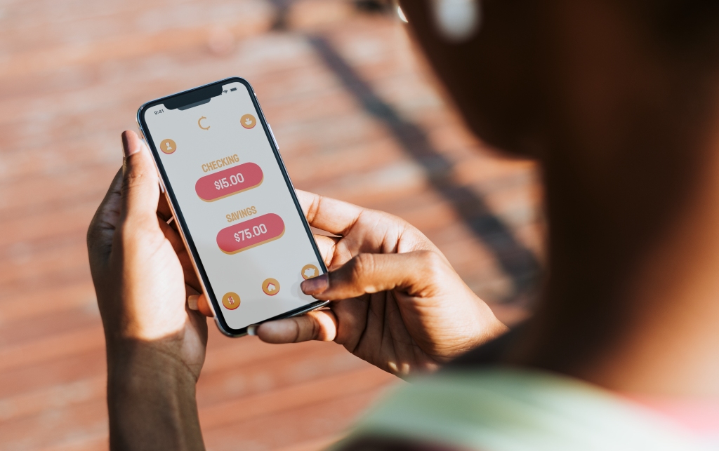
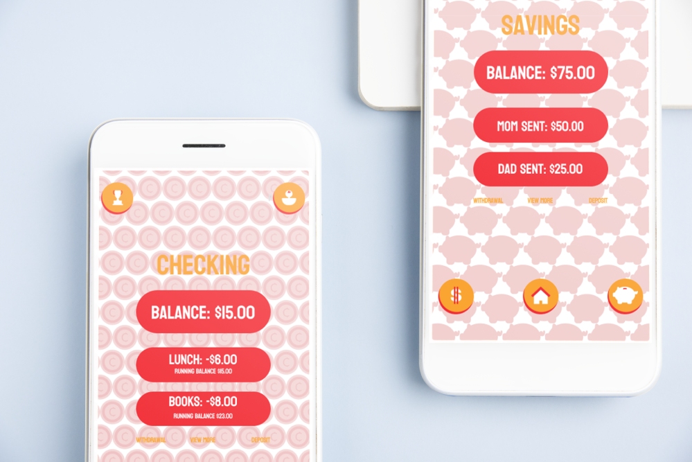
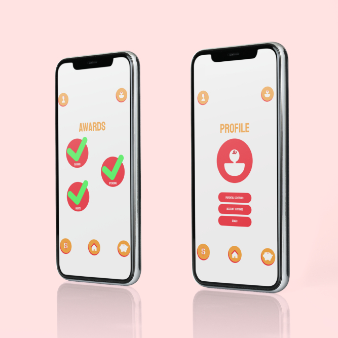
CashNest is a financial education app designed to teach kids aged 8-15 about responsible money management, saving, and budgeting in a fun and interactive way. This case study delves into the design and user interface aspects of the app, highlighting its icon designs and key interface pages.
CashNest
01 About:


02 Persona:
Emily Taylor
Demographics
- Age: 10
- Gender: Female
- Location: Suburban Denver, CO
- Education: 5th Grade Student
- Background: Lives with her parents and a younger brother. Both parents work in professional jobs and emphasize the importance of education and financial literacy.
Goals
- Short-term Goals: Understand the basics of saving money and how to manage a small allowance.
- Long-term Goals: Save enough money to buy a bicycle and learn how to budget for future Larger purchases.
Needs
- Easy-to-understand lessons on financial concepts like saving, budgeting, and spending.
- Engaging and interactive tools that make learning about money fun.
- Rewards and recognition to stay motivated.
Behaviors
- Enjoys using her tablet for games and educational apps.
- Watches YouTube videos on DIY projects and crafts.
- Participates in school activities like math club and student council.
Pain Points
- Finds traditional methods of learning about money (like lectures or books) boring.
- Limited real-world experience with managing money beyond a small allowance.
- Struggles with understanding abstract financial concepts without visual aids or hands-on activities.
Digital Proficiency
- Very comfortable using tablets and smartphones.
- Frequently uses educational apps and games.
- Capable of navigating apps independently but sometimes needs guidance on more complex features.
Motivations
- Enjoys learning new things, especially when presented in a fun and interactive way.
- Likes receiving rewards and recognition for achievements.
- Wants to impress her parents and friends with her knowledge about money.
03 Rationale:
CashNest is designed with a vibrant and user-friendly interface to engage kids aged 8-15 in learning about financial responsibility. The app uses bright colors and playful graphics to create a welcoming and enjoyable learning environment. The layout is intuitive, with large, easily clickable icons and clear navigation that allows users to quickly access different sections of the app, such as budgeting tools, savings goals, and educational games. The app’s interface is designed to be straightforward, minimizing complex terminology while maintaining enough depth to foster an understanding of financial concepts.


04 Icon Design:
The icons use a consistent color palette that matches the app’s overall branding, typically featuring shades of red, white, and gold to symbolize money, security, and growth. This unified approach helps users intuitively understand the purpose of each button, facilitating a smoother user experience. The simplicity of the icons ensures they are not only appealing to the young target audience but also straightforward to use, contributing to the app’s fun and interactive learning environment.
